DTE Energy undercounts service interruptions on power outage website
The utility giant used two datasets to report outages, with a lower estimate prominently featured on its dashboard.
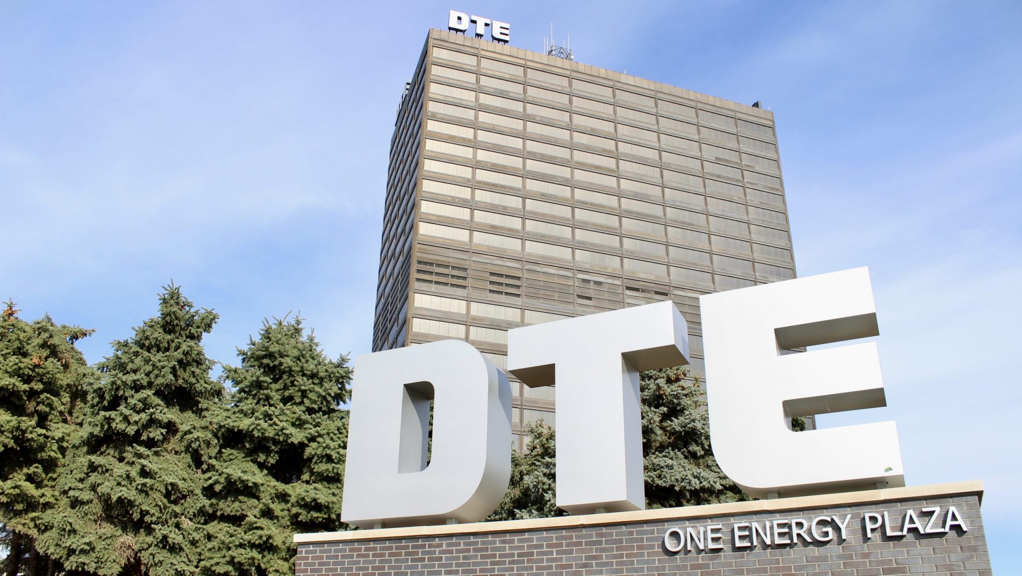
DTE Headquarters in downtown Detroit.
Numbers displayed on DTE Energy’s website have underestimated the extent of the utility’s power outages in Michigan.
Recent figures cited by the company on its Outage Center dashboard and mobile app provide a lower estimate, reflecting outages as tracked by electric meter readings. DTE officials say that analysis can be inaccurate because of disruptions caused by severe weather events like last week’s severe ice storm, which left upwards of 800,000 households and businesses in Michigan without power.
“The same electrical system that’s damaged from ice, our network to talk to the meters gets damaged, too,” DTE’s Director of Digital Experience Jackie Robinson tells WDET. “When we’re showing the outage counts on that Outage Center, we’re showing only the ones we know to be definitively true based on what the electric meters telling us.”
Accounting for the difficulty in obtaining accurate information at the onset of a major outage, DTE officials also generate a secondary estimate based on customer service calls and electric grid analysis. That prediction is used to generate map data and graphics. Throughout the past week, those figures have displayed tens of thousands of more outages than the Outage Center estimate.
“In that splash page, that might be a little low — and the map is too big,” says Robinson. “We’re always trying to refine it and get more information back from the field so that the number is accurate on the splash page.”
The discrepancy between the two figures has been noted by consumers and analysts alike.
PowerOutage.US, a website that reports and aggregates utility outages across the U.S., has issued a disclaimer on its profile of DTE following WDET’s inquiry.
“[DTE Energy’s] outage map does not match DTEE outage summary page. DTEE has been notified of the issue. Our data feed is from DTEE’s outage mapping system,” the disclaimer reads.
As a follow-up, I started more rigorously tracking the numbers that DTE publishes on their outage dashboard compared to the numbers that DTE has through their mapping API.
for the most part, # of customers w/o power in API > # of customers w/o power in public dashboard https://t.co/VkP49oudbH pic.twitter.com/oQCX0Yb01o
— Eric Lau (@erxclau) March 2, 2023
The Michigan Public Service Commission requires companies to report outages when a major service interruption occurs. But state regulators say they do not have rules governing how outage data is published on utility websites.
“We are aware of the outage reporting discrepancies and share concerns about getting accurate outage information to both the MPSC for its regulatory purposes and to customers who deserve an accurate accounting,” said Matt Helms, a spokesperson for the Public Service Commission, in a statement. “We will take a look at the issue of power outage reporting as we review the utilities’ response to this ice storm and the widespread outages customers have endured.”
DTE Energy recently updated its outage management system, introducing a new map just weeks before last week’s ice storm. The map identifies outage clusters as similarly sized white bubbles, with additional viewing options detailed by zip code and county. Many users have complained online that it’s more difficult to find block-level outage areas on the new map. DTE officials say they are adjusting the system based on feedback.
The data discrepancies come as local officials demand more oversight of the utility giant. Pontiac City Council unanimously passed a resolution calling for a state committee to investigate DTE’s outages and research the viability of nationalizing the electric grid.
“If it’s going out every time I have a storm, that’s not how utilities should work,” says Pontiac Council Member Mikal Goodman. “There are better things that are possible. We just have to force the people to do them.”
The following interview was edited for clarity.
Eli Newman, WDET News: Earlier this year DTE unveiled a new map that a lot of users got to experience over these past few days. Can you walk me through that decision? Why was that decision made and what was the timeline?
Jackie Robinson, DTE Energy’s Director of Digital Experience: Over the past couple of storm seasons, our beloved map which we’ve had for 20 years would struggle when we had these large outage events like we have right now. It would crash. It was a homegrown solution. It was time for some new technology upgrade. About last year, we started looking into a replacement map. We’ve been working with this map internally since September. I kind of experienced some of the same things that our customers are experiencing right now when I was getting used to it.
I know I was one of those users, as I’m checking things for news reports to see where these outage clusters are. And one of the things that I personally found was that it was kind of difficult to figure out where specific outages were. Before, you could find things in your neighborhood, these little clusters.
Those clusters, polygons we call them, they’re still there if you zoom in. They’re just not like the splash page. Instead, the splash page has what we call clusters, the little bubbles with the numbers in it. But if you zoom in on those bubbles, you’ll eventually get to your polygon.
One of the other things that I was wondering about are these discrepancies that we get sometimes when we’re talking with people who are utilizing DTE Energy map data. One of the biggest providers of that is PowerOutage.us that I’m sure you’re familiar with. A lot of people are able to access it and it provides an outage map utilizing the same data that is provided on this map that you have. But often that number is different.
I’m looking at the outage map right now, for instance, and it says on PowerOutage.us that 63,000 customers are out. But when you go to the splash page on the outage center on the DTE app, it would say it’s 26,000. So there’s a pretty big discrepancy between these numbers. Why is that happening?
We have an outage management system, a whole software system that helps us figure out who is out, how do we dispatch crews, all that kind of thing. And it is actually brand new — it’s about three weeks old. The outage management system takes information. You called, your neighbor called, 10 [Advanced Metering Infrastructure] meters in your neighborhood reported back to us. We take that information into the outage management system and we say there’s 100 people on this circuit, we’ve heard from 10 of them, and we’ve got 10 more AMI calls. The system will say, “I think that the whole circuit’s out. I think 100 people are actually out.” Then that information is what the map shows what we’ve predicted to be out, not what we know to be out.
On one hand, you have a map showing what is essentially a prediction based off a series of different qualifications. And then there is data that you know for certain? Explain how you know outages specifically.
We’ve predicted that there’s 100 people out, but we now know 10 people called, 10 AMI meters, and our system starts to check the AMI meters in that area too. Your electric meter on your house, that meter talks to us and tells us whether you’re off or on. And as we go through the outage event, we start to get information back from those meters. Every hour, we’ll get some more information back from those meters. When we’re showing the outage counts on that outage center, we’re showing only the ones we know to be definitively true based on what the electric meter is telling us.
For instance, when somebody is looking at the map, and they look at their zip code, and it says that maybe there’s 10,000 outages, that’s generally a guess?
I wouldn’t say it’s a guess. It’s a real educated guess. It’s a prediction.
A predicted estimate?
Yes, especially in these really large outage events. The same electrical system that’s damaged from ice, our network to talk to the meters gets damaged, too. We can’t talk to all of them. We know we’ve got this much signal back. But we realize if we get this much signal back, we’re going to predict that the outage is actually this big. Because if you’re in that predicted outage area, so like take your neighborhood that I was saying, if it’s a circuit with 100 people, your neighbor might not have called in his outage or her outage, but they would want to go to the map and make sure that polygon is on their area. That’s why we want to show predicted outages on the map, so that people that haven’t called will actually see their outage too.
Maybe to put it another way, is it fair to say that the map shows a low confidence estimate of what the outages are? Whereas that splash page shows more of a high confidence estimate of outages?
Correct. I would say it’s high confidence and then the other one is like medium confidence. I would say during a regular blue sky day, the map and that number are going to match.
Basically, there is an assumption though that there are meters that are not connecting with the system because whatever is causing the outage is preventing the connection from happening. Maybe it’s more proper to say there’s at least this many outages?
We won’t get 100% of the meters back, so you’re right. In that splash page, that might be a little low and the map is too big, right? So we’re always trying to refine it and get more information back from the field so that number is accurate on the splash page.
It sounds like it’s really hard to know for certain at any given moment exactly how many outages DTE Energy is experiencing during one of these extreme weather events.
In the beginning of a storm, you’re right. We’re missing some information. But as you get through an event, things start to regenerate. It gets better as we get through the event.
When people lose power for several days, I think there is a lot of questions that they have. There is almost like an immediacy in what people want to know about what’s going on with their situation. What do you wish that people knew about your job and what your team is dealing with in one of these moments?
I want them to know that we hear their frustration. I want them to know that we can do better. That’s what I would want customers to know. We know how important it is to communicate. It is some of our guiding principles to get good information to customers — and we’ve got work to do.
Trusted, accurate, up-to-date.
WDET strives to make our journalism accessible to everyone. As a public media institution, we maintain our journalistic integrity through independent support from readers like you. If you value WDET as your source of news, music and conversation, please make a gift today. Donate today »