Population and Poverty: A View of Detroit, the State and Other Big Cities [Maps, Charts]
What do these poverty and population data say to you? Detroit Today Host Stephen Henderson leads that conversation.

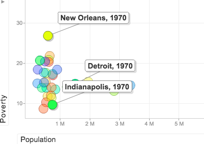
Poverty Rates Across U.S. Cities
Press “play” and watch how the populations and poverty rates change in various American cities, including Detroit. This interactive Google Motion graphic allows you to watch the trends over the years and isolate a particular city by selecting it.
Here’s another look at the U.S. cities we charted. “Hover” over each to see individual city data about population and poverty.
Poverty Rates Across Michigan Cities
On this map of Michigan, “hover” your cursor over a city, indicated by a blue dot, to view its population, poverty rate and median household income. The same data may be found in the chart below the map for another way to view the information and compare cities.
Population Fluctuations In Michigan Cities, 1940-2013
With this Google Motion graphic, you can press “play” and watch how the populations in Detroit and Wayne County decline while Oakland and Macomb counties gain population. This interactive Google Motion graphic allows you to watch the trends over the years and isolate a particular region by selecting it on the left side.
Powered by The Detroit Journalism Cooperative with support from The James L. Knight Foundation, The Ford Foundation, and Renaissance Journalism’s Michigan Reporting Initiative.
